 Contribute to Kestra Documentation
Contribute to the Kestra Documentation.
We love documentation contributions. To contribute to the documentation, fork the docs repository and create a pull request with your changes. We'll happily review and merge your suggestions into the documentation set as quickly as we can.
Build the documentation locally
The following dependencies are required to build Kestra docs locally:
- Node 14+ and npm
- An IDE (such as VS Code, IntelliJ, etc.)
To start contributing:
- Fork the repository
- Clone the fork on your workstation:
git clone [email protected]:{YOUR_USERNAME}/docs.git
cd docs
Use the following commands to serve the docs locally:
# install dependencies
npm install

# serve with hot reload at localhost:3001
npm run dev

# to generate static pages
npm run generate

# making a production build
npm run build
In addition to contributing content and understanding the overall structure of the documentation, it's important to become familiar with the custom Markdown components and patterns used throughout the Kestra Docs. For those contributing to the Kestra Plugin documentation, a basic understanding of plugin structure and Java syntax for doc strings is required.
This guide is designed to help external contributors get up to speed with the tools, conventions, and components you'll encounter when contributing to Kestra's documentation.
Contribute to the Kestra documentation
ChildCard
The documentation is structured on multiple levels. The top level is an index page such as "Getting Started," "Workflow Components," and "Cloud & Enterprise Edition." This acts as a landing page for all content that falls under those high-level categories. To serve a visitor everything within that topic, we use a ChildCard component on the index page. This component is built from the ChildCard.vue file in the components/content directory.
The index file's markdown looks like this:
---
title: Getting Started
---

Follow the [Quickstart Guide](./01.quickstart.md) to install Kestra and start building your first workflows.

:::ChildCard
:::
And the page displays the following with all the sub topics of "Getting Started" listed with their card and icon:
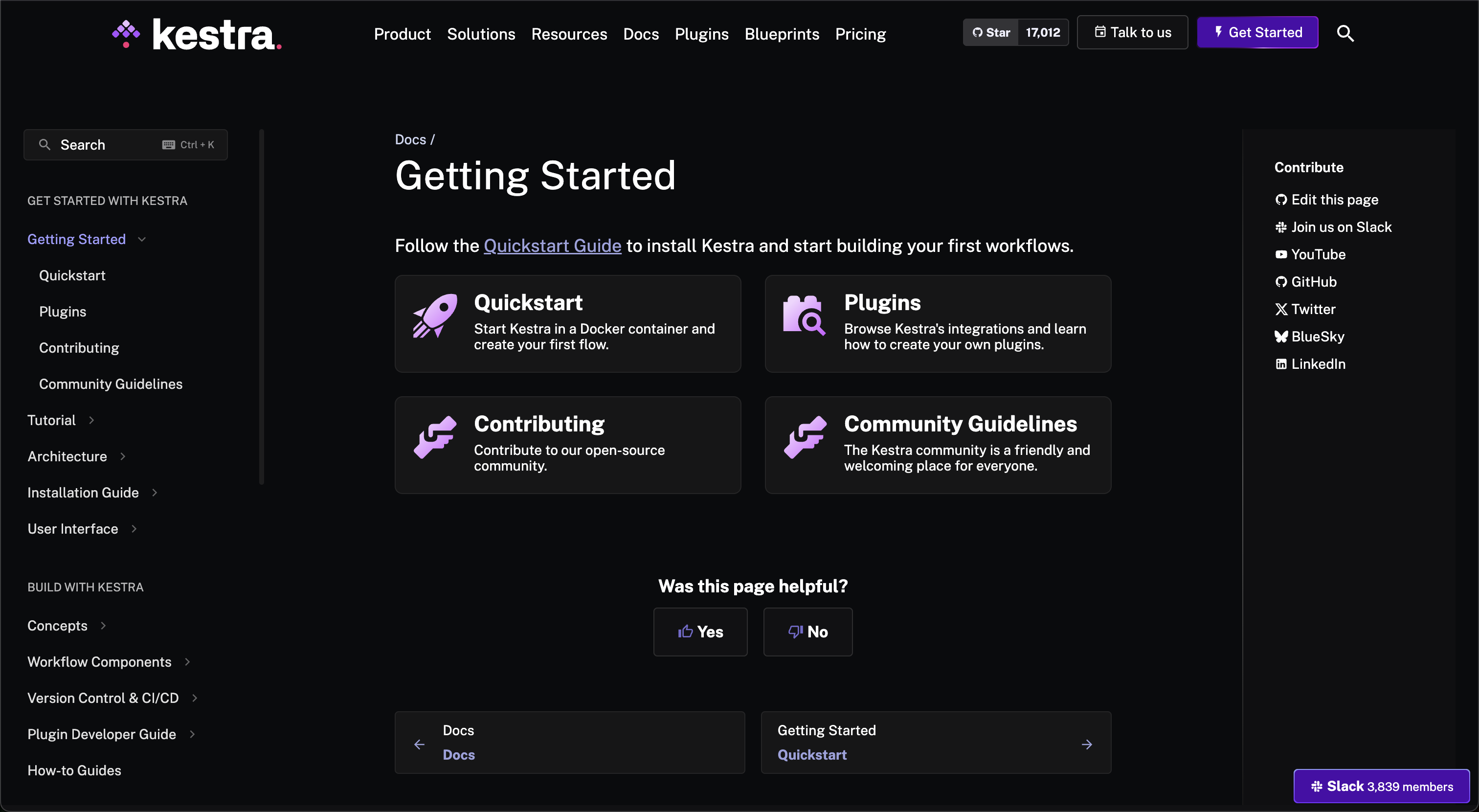
Note that when writing a standalone documentation page, the first sentence appears in the ChildCard view to introduce the topic. In the above example for Quickstart Guide this sentence is visible:
Start Kestra in a Docker container and create your first flow.
Ideally, keep this first sentence as clear and concise as possible to not clutter the view on the card.
Front matter
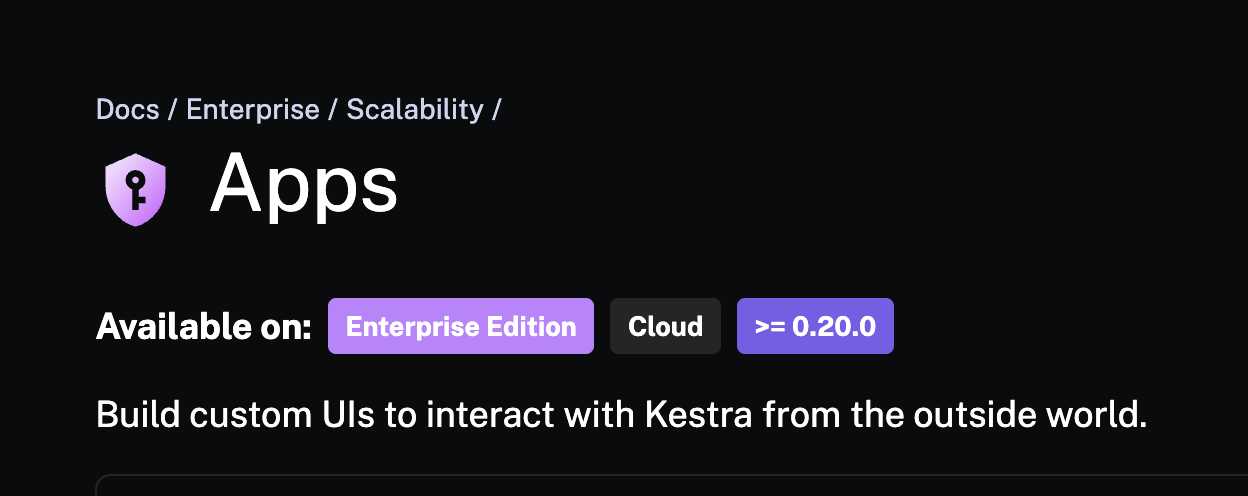
Each documentation page is expected to include several key front matter properties. We briefly mentioned one of them, icon, in the last section. For example, take our Apps page. This is the front matter specified on the markdown page:
---
title: Apps
icon: /docs/icons/admin.svg
editions: ["EE", "Cloud"]
version: ">= 0.20.0"
docId: apps
---
And this is the resulting view:
Let's discuss each property in more detail.
title
This is simply the title of the page, but it is important to make sure this is clear. Typically, this will be the name of the feature or the concept, but as a contributor, you may want to write your own "How to guide" with your Kestra use case. In this scenario, be clear about the purpose of the guide and with what feature or Plugin (e.g., Access Files on your Local Machine in Kestra ).
icon
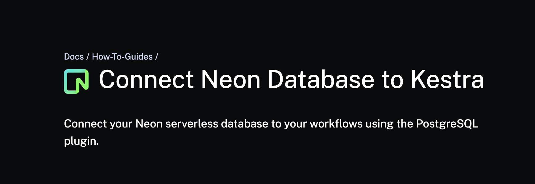
Icons are SVG files that are used to identify a certain tool being used or a general concept. They appear at the top of all documentation pages and in the ChildCard of the page. For example, this Neon with Kestra guide has the following properties:
---
title: Connect Neon Database to Kestra
icon: /docs/icons/neon.svg
stage: Intermediate
topics:
  - Integrations
---
And appears on the site as follows:
The icon lives in the public/docs/icons folder path and is specified as Neon, so the correct logo shows for the tool. General icons, such as api.svg or installation.svg, are also available in the folder. If you contribute a guide incorporating a tool without an existing icon, place the appropriate SVG file in this folder and reference it in the front matter.
topics & stage
Our How-To Guides require a couple of extra front-matter properties to provide clarity to the site visitor about the guide's topic and level: topics and stage. Using the same example as above, you can see that the properties are set as stage: Intermediate and topics: Integrations.
---
title: Connect Neon Database to Kestra
icon: /docs/icons/neon.svg
stage: Intermediate
topics:
  - Integrations
---
These properties are const variables set in the GuidesChildCard.vue file of the repository. They have a set list to choose from when classifying a guide. For example, stage can be "Getting Started," "Intermediate," or "Advanced." topics can be a multitude of different concepts such as "Scripting," "Kestra Concepts," "Best Practices," and more. If your guide doesn't fit into any of the existing topics, feel free to suggest a new one, and we’ll review it.
editions
Kestra has three editions: Open Source, Enterprise, and Cloud. A feature or guide may be relevant only to one, two, or all editions, so we have a front-matter property to specify that right at the top of a page for the reader. For example, depending on the Kestra edition, there are different pages relevant to handling secrets. We have a Kubernetes Secrets How-to Guide where we set the edition as OSS in the front matter:
---
title: Set Up Secrets from a Helm Chart
icon: /docs/icons/helm.svg
stage: Getting Started
topics:
  - Kestra Concepts
  - DevOps
editions: ["OSS"]
---
And we have a page for Secrets that is specifically for Enterprise & Cloud users.
---
title: Secrets
icon: /docs/icons/admin.svg
editions: ["EE", "Cloud"]
docId: secrets
---
version
Like editions, some Kestra features are only available in specific Kestra versions and onwards. We use the version property in the front matter to identify this in the documentation. For example, Worker Groups are only available starting in Kestra version 0.10.0. This is specified as follows:
---
title: Worker Group
icon: /docs/icons/admin.svg
editions: ["EE"]
version: ">= 0.10.0"
---
docId
One of Kestra's major benefits is its in-app contextual docs. This means that when constructing flows in the platform, you can access the documentation in the same interface without having to navigate to the browser to check against our documentation. This is done through the docId front matter.
Kestra knows that you are working with Apps, and it can show you the relevant documentation without a task switch.
The same is true for all the main components of Kestra (e.g., Namespace, Flow, Blueprints, Plugins, etc.).
release
release is a front matter property only relevant for our Migration Guides. These guides outline the need-to-know information for upgrading from one version of Kestra to another. This includes renaming a feature or "Before and After" examples of an action in Kestra. Example configuration looks like this:
---
title: Restarting parent flow
icon: /docs/icons/migration-guide.svg
release: 0.21.0
editions: ["OSS", "EE"]
---
Customized text
We use several components to add customized text presentations in the documentation. To differentiate important information from average text, we use three different levels of alert types: "info," "success," and "warning."
This is important to note.
Yippee, it worked.
This is a warning, but it's fine.

Another helpful component we use is :::collapse. This tag keeps the documentation space-efficient and hides long examples or other information that does not need to be seen when scrolling the page. Still, the reader can open it up to reveal its content. This is particularly useful for flows that could otherwise take up a lot of space on a page or FAQ Answers that may not be relevant to every reader and can be selected as needed.
Use the following syntax with whatever should be collapsed within the colons and the title inline with :::collapse:
:::collapse{title="Introduction to whatever is collapsed"}

Here is where the collapsed text goes.

:::
Here is a full example using a flow and subflow with a ForEach task:
While a feature may be available after a specific Kestra version and indicated in the front matter, an additional function may be added in later versions that don't match the front matter. We use the ':::badge' component to indicate this in the documentation for only a particular page section. This component can be used at any point on the page rather than solely at the top.
The component has the following syntax, able to include both version and editions like the Front Matter:
:::badge{version=">=0.15" editions="OSS,EE,Cloud"}
:::
Available on:
>=0.15Open Source EditionEnterprise EditionCloudVideo container
In the documentation, we try to always have an accompanying video for the discussed feature. To ensure the YouTube video is embedded and displayed correctly and consistently on every page, we use a custom video-container div class. Add the div after the page's introductory sentence and before the main content.
<div class="video-container">
  <iframe src="https://www.youtube.com/embed/97xvcAMf888?si=y9vEEtGvoHfLxsK4" title="YouTube video player" frameborder="0" allow="accelerometer; autoplay; clipboard-write; encrypted-media; gyroscope; picture-in-picture; web-share" referrerpolicy="strict-origin-when-cross-origin" allowfullscreen></iframe>
</div>
The video-container is maintained in the repository's docs.scss file. Refer back to the top of this page or check out the Contributing Guide an embedded video.
Code blocks
When including code blocks in the documentation, specify which language the example is written in. Typically, in the Kestra documentation, example flows are included to demonstrate a feature; they are defined as a yaml code block. For example, see the following flow in markdown:
```yaml
id: getting_started
namespace: company.team
tasks:
  - id: hello_world
    type: io.kestra.plugin.core.log.Log
    message: Hello World!
```
The supported languages for code blocks are fully listed in the useShiki.ts file in the repository, and if you need something new added, you can make an addition there.
How to use images
Images are a key part of the documentation. We organize images by topic and section in the documentation to make them easy to find and add. Taking this guide as an example, an image we used earlier in the guide appears in the markdown as follows:

The image has a clear title and is located in an image folder called docs-contributor-guide in the public/docs directory of the repository. For this guide, all images are placed in this folder path so the organization is clear and easily worked with by another contributor. This same practice is used for our blog and other parts of the website that are kept in the repository.
Contribute to Kestra Plugin Documentation
Kestra Plugins each have their own documentation page on the website in Plugins. Each plugin also has in-app contextual documentation so that task and property definitions are easily usable while building flows. Plugin docs are maintained in separate repositories rather than the product documentation.
For example, if you want to contribute to the OpenAI Plugin, you can find the documentation in the OpenAI Plugin Repository.
All plugin repos are searchable from the central Kestra GitHub. The name of the repository is in the URL of the plugin documentation page. For example, the OpenAI repo is called plugin-openai which is in the URL path https://kestra.io/plugins/plugin-openai/io.kestra.plugin.openai.chatcompletion. Simply searching the tool's name should suffice, but this always works just in case.
To contribute to a plugin's documentation, fork the repository. Once cloned, contributions are welcome to four key components of plugin task documentation: title, description, examples, and properties.
Continuing with OpenAI, the tasks include ChatCompletion and CreateImage.

Each task is in the path src/main/java/io/kestra/plugin/openai. This will be similar to all other plugins (i.e., src/main/java/io/kestra/plugin/<insert-plugin-name>). To improve or add to the documentation, open the Java file for the task and edit the @Schema, @Plugin, and @Example doc strings.
You do not need to be well-versed in Java to contribute to the plugin documentation. The doc strings are organized so that they are easy to work with, and we will review any contributions anyway, so have no fear. You can read more about how we instruct developers to document their plugins in the Plugin Developer Guide.
The plugin documentation will generally look like the following:
@Schema(
    title = "Given a prompt, get a response from an LLM using the OpenAI’s Chat Completions API.",
    description = "For more information, refer to the [Chat Completions API docs](https://platform.openai.com/docs/guides/gpt/chat-completions-api)."
)
@Plugin(
    examples = {
        @Example(
            full = true,
            title = "Based on a prompt input, generate a completion response and pass it to a downstream task.",
            code = """
                id: openai
                namespace: company.team

                inputs:
                  - id: prompt
                    type: STRING
                    defaults: What is data orchestration?

                tasks:
                  - id: completion
                    type: io.kestra.plugin.openai.ChatCompletion
                    apiKey: "yourOpenAIapiKey"
                    model: gpt-4o
                    prompt: "{{ inputs.prompt }}"

                  - id: response
                    type: io.kestra.plugin.core.debug.Return
                    format: {{ outputs.completion.choices[0].message.content }}"
                """
        ),
The key properties to consider are:
title: A concise single sentence describing the task's objective that is displayed in the Kestra in-app contextual docs.description: Additional information such as links to the external tool's documentation or best practices for using the task.examples: Flow examples that demonstrate the task in use. Best if it is a logical use case utilizing multiple Kestra features (e.g., Triggers, Inputs, Outputs, etc.).
Similarly to the main plugin attributes, the properties are documented with a title and a description. For example, the OpenAI ChatCompletion properties:
public class ChatCompletion extends AbstractTask implements RunnableTask<ChatCompletion.Output> {
    @Schema(
        title = "A list of messages comprising the conversation so far.",
        description = "Required if prompt is not set."
    )
    private Property<List<ChatMessage>> messages;

    @Schema(
        title = "The function call(s) the API can use when generating completions."
    )
    private Property<List<PluginChatFunction>> functions;

    @Schema(
        title = "The name of the function OpenAI should generate a call for.",
        description = "Enter a specific function name, or 'auto' to let the model decide. The default is auto."
    )
    private Property<String> functionCall;

    @Schema(
        title = "The prompt(s) to generate completions for. By default, this prompt will be sent as a `user` role.",
        description = "If not provided, make sure to set the `messages` property."
    )
If any titles, descriptions, or examples could be improved or added, create a pull request or issue for the specific plugin repository, and we will happily review and merge it into the set.
Contribute to Kestra Blueprints
The official Kestra Blueprints library can be found under kestra.io/blueprints. Blueprints are a curated, organized, and searchable catalog of ready-to-use examples designed to help you kickstart your workflow. Each Blueprint combines code and documentation and can be assigned several tags for organization and discoverability.
To contribute a Blueprint or modify an existing one, clone the Blueprints repository. Within the repository, there are blueprints for Apps, Dashboards, and Flows.
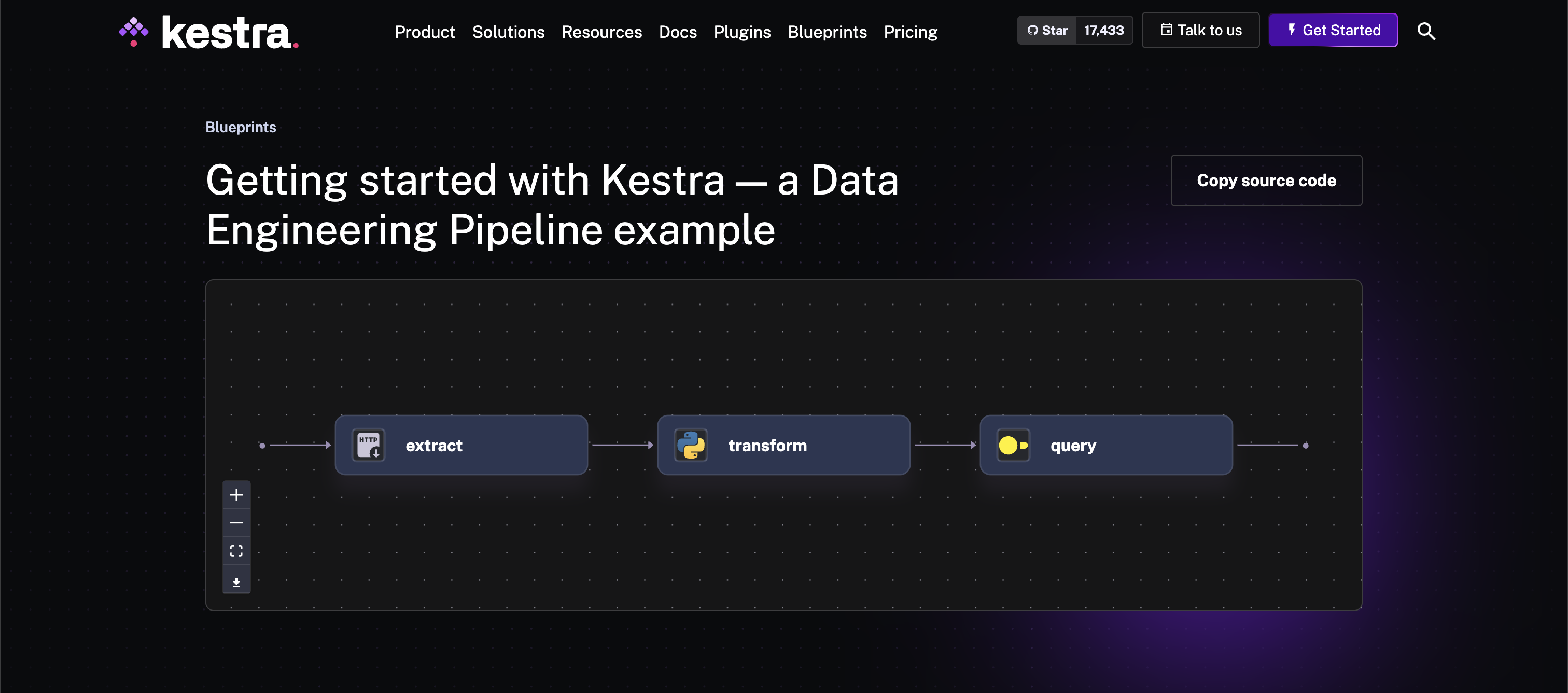
All Blueprints are yaml files composed of the example Flow, App, or Dashboard and an extend property that specifies attributes such as title and description to propagate onto the website. For example, this Getting Started with Kestra – a Data Engineering Pipeline has the following extend property:
extend:
  title: Getting started with Kestra — a Data Engineering Pipeline example
  description: |
    This flow is a simple example of a Kestra flow used for a data engineering
    use case. It downloads a JSON file, filters the data, and calculates the
    average price per brand.

    The flow has three tasks:
    1. The first task downloads a JSON file.
    2. The second task filters the data and writes it to a new JSON file.
    3. The third task reads the filtered data, calculates the average price per
    brand using DuckDB, and stores the result as a Kestra output which can be
    previewed and downloaded from the UI.
  tags:
    - Getting Started
    - API
    - Python
    - SQL
  ee: false
  demo: true
  meta_description: This flow represents a data engineering use case. It downloads
    a JSON file, filters the data in Python, and calculates the KPIs in SQL
    using DuckDB.
Check out the full file to see the Flow's YAML.
For the Blueprint to be easily searchable, it is essential to include the appropriate tags. A complete list of tags is available on the Blueprints homepage.
With the proper YAML and extension, the Flow's topology will display interactively on the Blueprint page along with a Copy source code button and task icons.
If you have ideas for new blueprints or existing titles, descriptions, or examples that could be improved, create a pull request or an issue on the Blueprints repository. We will happily review and merge it into the set.
Was this page helpful?